ReminderX
ReminderX is a fictional to-do and reminder app that helps users manage their tasks and to-dos.
I completed this project as part of the introductory course in my M.S. UXD program at Kent State University. This was my first stab at owning the entirety of a UX project, from research to design to iteration.
Problem
Task management apps are meant to simplify organization, however many fail to seamlessly integrate into their users’ everyday lives. Between personal and work responsibilities, it can be difficult to jump between tools and track tasks, deadlines, and priorities.
ReminderX was ideated to bridge this gap, becoming not only a task organization application, but an essential part of its users’ lives. However, without a clear understanding of user wants, needs, and behaviors, the team was struggling to create a product that turned their vision into a reality.
User research
No progress could be made if we didn’t understand the platform’s target audience.
I kicked the project off by conducting phone interviews with four participants, gauging their task management preferences, experiences with existing tools, and personal organization methods.
Findings
Through these conversations, one key pain point emerged—task consolidation. Having to track tasks between differing tools with differing abilities left users exhausted.
Users wanted a system that worked with their needs, not against them.
Beyond consolidation, users wanted to feel like they were making tangible progress on their tasks. Prioritizing items within the platform could signify importance and boost motivation.
Reminder notifications and task color coding also stood out as important features to participants.

User journeys
Taking research findings into account, I mapped out common user journeys to help visualize how ReminderX’s target audience would interact with the platform.


Early design explorations
With the knowledge of how users would navigate through the ReminderX application, I started developing solutions through rough sketches. The examples below spotlight the onboarding and reminder creation experiences.


Initial wireframes
The initial wireframes provided a more detailed structure for key workflows. After feedback from team members, the below wireframes were submitted as the final project deliverable.

Getting Started Experience

Create Reminder Experience
Design refinement
The initial wireframes were a great starting point for the project. However, since my introductory course, I have gained more experience, honed my skills, and grown overall as a designer.
With this growth, I revisited and refined the wireframes. Applying lessons from my coursework and personal learning, I developed a more polished, usable version of the original design.
Key changes made to the designs included:
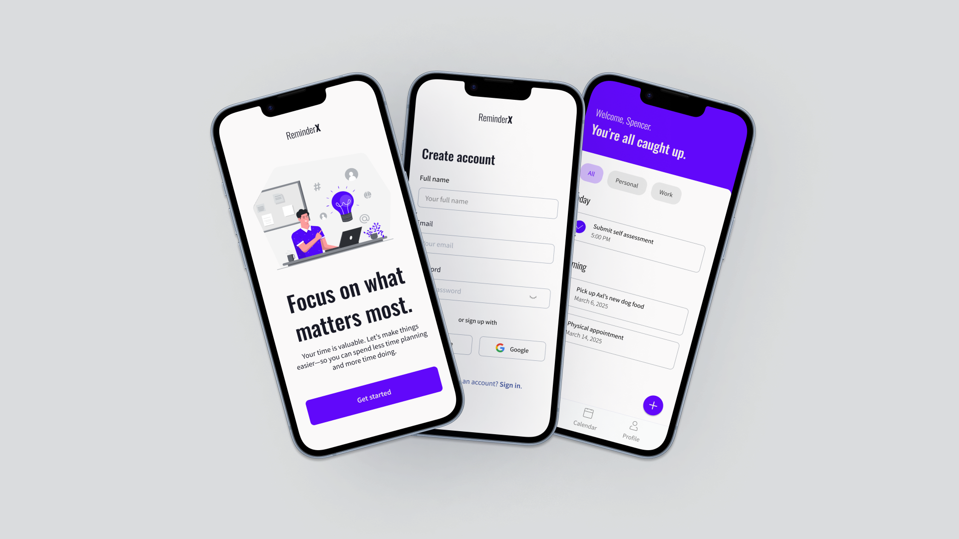
Log-In Experience — Rather than incorporating both the Sign In and Create Account experiences within the same screen, two separate screens were developed with minor callouts at the bottom of each to lead users should they require that information.
Task Content Display — Tasks now include the task name and date or time from the Home screen. These cues can provide an upfront reminder about task due date or time right from app-open.
Create Reminder & List Flow — The creation button lives as a floating action button within the homepage. Having it live on top of content helps to free up space on the bottom navigation and draw attention with it’s contrasting color to the background.
Homepage Messaging — The message appearing on the homepage will change to reflect tasks due on the day of app-open or tasks that are past due. When all tasks are completed before and through the current day, the message will flip to reflect that the user is caught up.


Lessons learned
This project was a crash course in navigating and owning the UX process—from research to iteration. Going back to my designs after gaining more experience gave me the chance to refine key workflows and improve usability. However, more than anything, this process reinforced the value of staying user-focused, looking for ways to continue to grow as a designer, and reflect upon how far I have come!