Joplin Public Library
The Joplin Public Library is a key part of its community, helping citizens learn, stay informed, and connect with a range of resources.
This project was conducted as part of an Information Architecture course in the Kent State M.S. UXD program. Over 8 weeks, I analyzed the library’s website content, conducted user research methods, and restructured the site to make information discovery easier.
Problem
Public libraries serve a diverse set of patrons. Their websites must accommodate numerous resources—from books to digital archives to community services—each serving their own purpose. With an expansive user base and vast information to organize, library websites must be able to balance deep content structures with the varying literacy and technology skills of their users.
Libraries should make exploring information easy. When information is hard to find, users miss out on library offerings.
Like many others, the Joplin Public Library struggled to support its vast array of content. Navigating the site and finding information were challenging processes.
User research
To design a better experience for users, you first need to understand them. I began the research process by interviewing two librarians experienced in working with their library’s websites.
Both individuals were asked questions aimed at better understanding how users interact with library websites, what obstacles they face in their experiences, and what is most important to them. Hearing their experiences firsthand helped me better spot user frustrations.
In addition to interview insights, I conducted archival research on library website usability. Pulling information to supplement interview findings and best practices helped to form a better picture of usability barriers in patron experiences.
User research revealed three priority areas for the redesign: prioritizing the online catalog, enhancing search and filtering capabilities, and improving the information architecture.
Information architecture
To design a better experience for users, you first need to understand them. I began the research process by interviewing
After developing an understanding of user priorities and areas of focus, I conducted a content audit on the site. The primary goal was to identify content relevant to the platform, determining which pages were essential, which could be removed, and areas for new content to be developed.
I reviewed how pages were linked, how deep the navigation went, and where users might get lost. These insights informed the development of the proposed classification schemes and sitemap for the Joplin Public Library redesign.
The sitemap reflects the improved information architecture, providing a blueprint for subsequent project phases.

Usability testing
To test its effectiveness, I took the proposed architecture and conducted a tree test. 11 participants were recruited, screened, and given tasks prompting them to show where they would expect information to be found using navigation verbiage.
Participants completed tasks like finding contact info or accessing digital resources.
Results
Participants were easily able to find general information about the library, such as hours of operation or information about current staff members. Tasks pertaining to children and teen program information and library card resources were successfully completed, though participants tended to take indirect routes.
Users still had trouble finding how to place a book on hold or check what the library had in stock—two of important user flows.
Users needed more intuitive, direct routes through the information architecture.
Wireframes
With a clearer structure in mind, I then developed wireframes representing pages where key user journeys occurred.

Pictured above are a few of the wireframes incorporating the proposed information architecture.
(Left to right: Homepage, Books & More page, About Us page)
First-click testing
Wireframes were then tested with 4 participants through first-click testing. Users were shown the proposed designs and asked to click where they would expect to find the information to complete said task.
Users successfully completed 8 out of 10 tasks, showing that the new structure resonated.
Beyond the assignment
As I revisited this project post-class term, I saw an opportunity to take it further. The initial wireframes addressed key usability challenges, however I wanted to refine the design that also felt more polished and visually engaging.
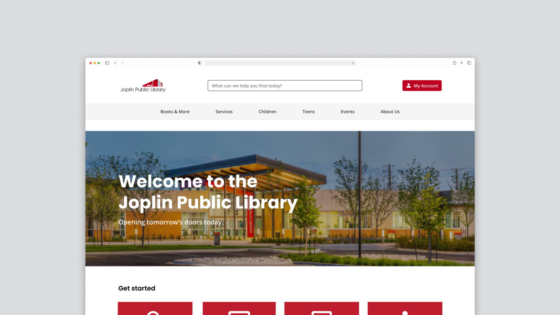
To achieve this, I crafted hi-fidelity mockups that built on the skeleton of the original wireframes. While the core structure remained intact, I adjusted the layout and components to better align with my current visual design skills. While the updates were not influenced by additional user testing, they allowed me to explore visual techniques and enhance the user experience.

(Left to right: Homepage, Books & More page, About Us page)
Taking this next step allowed me to explore visual design while having the usability foundation of the earlier project phases. I was able to bridge the gap between user-centric design and engaging user interfaces, helping me expand my UX wheelhouse.
Lessons learned
This project reinforced how small changes—like clearer labels and better content grouping—can make a big impact. Talking to librarians and testing with users showed me how important it is to gather diverse perspectives when designing for a wide audience. All information architecture needs real user feedback to maximize its effect.
The Joplin Public Library did not commission any of the work outlined above.